arrow_back_ios
BACK TO PORTFOLIO
Interaction Design/Midas
Rotary Design
Usability and interaction design for touch screen mixing desks
OVERVIEW
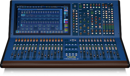
Midas create high end audio products known for their sound quality and low latency. Moving from analog mixing desks the company moved into digital desks with the pro-series in 2006, a suite of positively received digital desks with the famous Midas sound quality and convenience of digital audio.
The existing Midas pro-series mixing desks digital desks were aimed at traditional sound engineers. I joined the business as part of the UX/UI team developing the new Heritage-D 96 flagship model.
ROLE
Senior UX Designer
UX Design, Interaction Design, UI Design, Web Design, Brand Design, Product Strategy, Front-End XML Code.
RESPONSIBILITY
As part of a team tasked to redesign rotary user interaction. The task required investigative research, usability testing and iterative design.
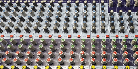
Rotaries afford space where larger controls would be unmanageable in both the physical and digital world
CONTROL INTERFACE
Traditionally screen rotaries are controlled by selecting and dragging along the x-axis or y-axis. Working similar to a traditional fader rather than physical rotary, the interaction relied on the user focusing on the visual feedback rather than 'feeling' the change in sound or audio response.
X-axis – Existing Midas Pro-series interaction

+ Familiarity to pro-series
+ Easy to use
+ No physical limit
- Invisible axis
- Fixed area of effect
Y-axis

+ Similar to fader movement
+ Easy to use
+ No physical limit
- Invisible axis
- Fixed area of effect
TECHNOLOGICAL IMPROVEMENTS
Adding a 21-inch touchscreen to a mixing desk made significant changes to the surface layout, removing majority of rotary controls. Removing these physical controls was a concern for pro-audio specialists who were trained on or experienced with analog mixing desks. It was important to introduce a control which worked similarly to the physical control, was easily recognisable and provided clear feedback.
INITIAL USER TESTING
The HD-96 mixing desk was in NDA so external testing was not possible, we were able to run AB and Hallway testing internally with software engineers, sound engineers and QA testers.
Interaction tests were undertaken with the existing X and Y-axis controls. It was clear immediately that the interactions were limited by screen space and visual feedback. The user could only drag to screen extents and would have to remain focused on the rotary position and value. The position of the rotaries on the screen also limited the amount the user could increase or decrease the value making the task of making large changes difficult.
The new screen afford a innovative approach to rotary control. It was proposed that due to the large screen area and touch interaction that a rotational approach was possible and would be more natural.
PROPOSED INTERACTION
Rotational

+ Acts similarly to physical rotary
+ Distance from rotation point increases precisions
+ Expandable fixed area of effect
- Working area limits
- Requires some learning
Ratio control

The rotary controllers ratio can be reduced to provide improved precision
At 2:1 it will take 2 rotations to reach the maximum value.
Y-axis
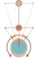
Rotational travel decreases as the contact point is moved further from the rotary centre, providing the user more precision
With the changes made to the interaction for touch screen, it was important to also provide better feedback to the customer and account for issues with blocking from touch placement. As we are moving away from traditional screen rotaries, controlled by selecting and dragging along the x-axis or y-axis, we must also consider how the user will approach the new interaction.
Updates are required to existing rotary caps as the touch areas are too small and block values when selected.
CONTROL APPEARANCE
As the HD96 was built to be an innovative new step in digital mixing desks, the visual aesthetic and feeling of the product was important. It was agreed to move away from the pro-series approach of replicating physical rotary knobs and update the rotary design to provide the most information and clarity to the user.

Larger touch targets were required to inspire user confidence and avoid mistouches

Adding an exterior indicator ring increased the touch area and improved visibility of the rotary level

The outer exterior indicator improved clarity by replacing the indicator line with a single point

The space afforded by using the point indicator allowed for a value and unit reading in the centre of the rotary
EXPANDING CONTROL
The main pain point from the Hallway and AB testing was the lack of indication that the rotary was selected. The initial solution involved expanding the rotary size and presenting the intended path to the user. By presenting the rotary in an expanded form it was clear that the user was interactive with it. Due to the increase in size the values and information provided could be larger and clearer to the customer.

Rotary expands to provide user clarity
SCREEN LIMITS
The usability of the rotary could be reduced by the position on the screen. Screen limits could cause unexpected release of the rotary and confusion for the user.
During user testing it was noted that some rotaries were important and may wish to be controlled at a moments notice and away from the screen they appear.

Rotary expands to provide user clarity
ADJUSTABLE POP-OUT ROTARY
The functionality of the pop-out rotary was improved by adding the ability to lock the rotary to the screen. The user is also able to move the rotary to anywhere within the screen area. This resolved issues with screen limits and also allowed sound engineers to set up priority rotaries on screen. Following feedback and as part of iteration rotaries could be pinned to surface hardware and controlled either on screen or with physical rotaries.
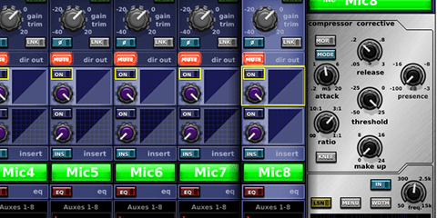
Once a layout was agreed all rotaries were updated across the software, with additional designs added for the on board rack effects.

Final rotary layout

Final design
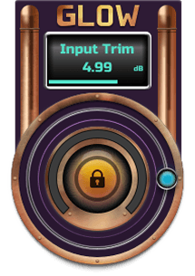
Glow example
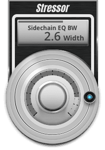
Stressor example