arrow_back_ios
BACK TO PORTFOLIO
UX/Arctic Shores
Selection Journey
Improved user journey and user testing for SaaS features
OVERVIEW
Arctic Shores are a psychometric assessment provider. Offering hiring teams the opportunity to sift candidates based on their assessment score via a distribution platform or directly via their ATS.
The existing product assesses candidates on up to four personality traits providing hiring managers overall percentile scores and individual trait scores.
As part of improvements to the product a new set of variables (skill enablers) were added to the assessment toolset, improving reliability and new approaches to assessing candidates.
ROLE
Senior UX Manager
UX Design, Interaction Design, UI Design, Product Strategy, Usability Testing.
RESPONSIBILITY
As senior stakeholder representing UX I was part of the kick-off and discussions regarding the opportunity to move to the new skill-based traits. I created a strategy based on the introduction of the new skill-based traits including a plan to sunset the personality traits.
The candidate experience will improve by reducing the number of tasks a candidate is required to complete.
SELECTION JOURNEY
The existing selection journey for personality traits required the customer to select a total of 4 personality based traits, with the opportunity to select up to 3 further additional cognitive traits (individual tasks based on hard-skills with only one correct answer.)
EXISTING USER JOURNEY
Customer selects between 4-7 personality traits
Customer prioritises top 4 traits
Additional cognitive traits added
Summary page provides final selection
DESIGN PROBLEMS
As part of continued customer feedback working cross squad with the customer success team it was found that users felt they had lost information during the journey and were often surprised when they reached the summary page to discover their final selection. Each page presented different information and often complicated instructions regarding best practice for recruiters (especially important when considering adverse impact). Further feedback working with the customer success team, and directly with customers showed value the summary page and shopping cart style.
Existing personality trait selection journey
Personality trait limit (4 traits)
Limited trait information
Unknown candidate experience
No fine controls over selection (each trait is equally scored)
Unclear multipage selection
Assessment scoring unclear
New skill-based traits selection journey
Unlimited selection (1-2-1 task mapping to traits)
Improved and expansive information
Task mapping gives accurate candidate task and completion time
Single page selection
Ability to weight each trait individually
Clarity on how assessment will be scored
WIREFRAME AND TESTING
Moderated interviews were completed internally and amongst key customers to introduce the new skill-enablers and also test the user journey
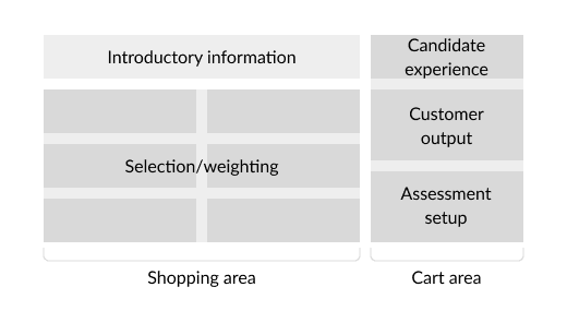
Customers showed confidence and understanding in the existing user journeys summary page. The page was updated to provide a shopping cart feel, showing the selections the customer had made on the left hand side. The right hand side gave a breakdown of the candidate experience and the expected output for the customer.
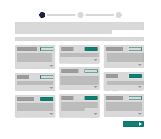
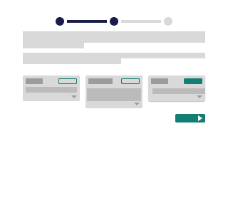
Design began on updating the journey to include the shopping cart column as a single page journey.
Initial single page shopping cart layout
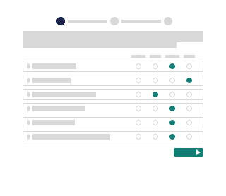
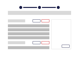
After iteration the above layout was tested internally by subject matter experts and lay users. While improvements had been made the single page reduced confidence in selection. A summary page where the assessment setup could be made was added to testing and confidence and approval.
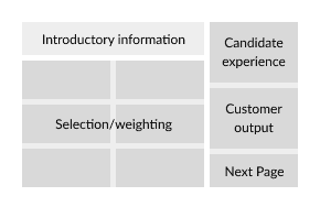
Selection page
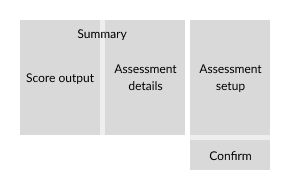
Summary page
Upon retest confidence improved and the new flow was agreed.
TRAIT CARDS
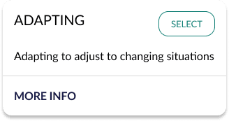
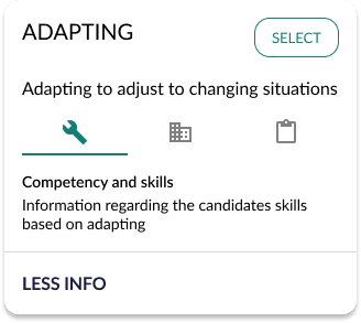
Customers select the traits they wish to assess their candidates using trait cards.
The existing personality trait cards provided the trait name and a brief description of the trait. By expanding the card the user could drill down to further information on competencies, skills and business values. Feedback from existing users provided by the customer success team and interviews showed that this information often felt too generic and traits were very similar.
Trait card
Trait card with information updated
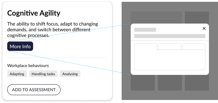
The original designs were limited by space in a masonry type grid and information was only presented within the cards. Developing the new skill-based trait cards it was important to show more information in the card and further details to customers looking for greater clarification.
The new approach to skill-based traits mapped each individual trait to a task, this reduced the requirement for users to compare similar personality based traits. The user only needed to access one trait at a time which freed up the requirement for expandable cards. Replacing expanding cards with modals which offered much more space and opportunity to provide detail to the user.
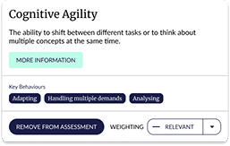
Updated trait cards present title, description and workplace behaviours.
More information is presented as an overlay
Open an example in Figma
open_in_new
I liaised with the Psychometric team to provide accurate and relevant information in the trait modal which we took to test. The design was agreed and the psychometric team concluded language, at this point we refined with developers and began development of the selection journey, cards and modal.
WEIGHTING
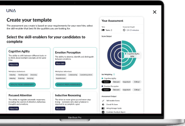
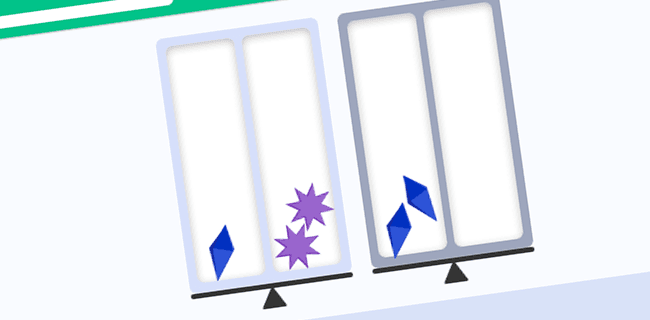
One of the advantages of the new skill-based traits was the option to change how much each trait contributed to the candidates final score, this was referred to as the weighting. As part of the early stage user testing I worked with users to select the best language for each weight. The weightings were set to four values: 25%, 50%, 75% and 100%; with the final language Relevant, Required, Important and Critical respectively.
Originally in the wireframe stage the weighting was added to the trait cards, but users often ignored the additional information and moved to the summary. As part of the testing we had also received feedback that it was difficult to understand how the weighting would effect the final score. The solution was to move the products existing radar graph into the selection journey.
Weighting was removed from the trait cards and moved to the right hand column (shopping cart). The weightings were presented as text to avoid user confusion.
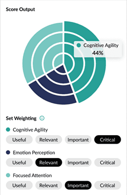
The modified radar graph was brought in to present how each trait contributed to the final score, including hover interaction to present percentage contribution.
Presenting the radar graph provided the customer with exactly the assessment output they can expect. The design was expanded to include details on the customer outputs and the candidate experience (including task number and time.)
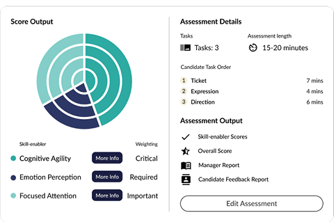
Final representation of the customer selection in the summary page
FINAL USABILITY TESTING
Mediated interviews and usability studies were undertaken with customers, friends and family testing. Reaching out to customers, peers from inside and outside of the business to find suitable testers, 10 users were found. The interview and study required a complex and expansive prototype to provide an accurate representation of the product without any build time from the developers.
Please contact me to try the prototype
Results were presented to the whole business in documentation and through presentation in sprint feedback sessions. Sticking points found in this stage were removed and changes were made to include a wizard guide for first time users.