
Candidate Report
TLDR: My Role & Results
Senior UX Manager
Product strategy, user research, prototyping, UI Design, cross squad collaboration.
My Role
I led and oversaw all work across the candidate feedback report. This included discovery, user research and designs.
I oversaw the design and launch and iterative improvement of the new candidate feedback report.
I introduced regular in-product feedback cadence to expose success metrics and present the value back to the wider business.
Results
4/5
Candidate approval rating
> 800,000
Candidates served feedback
1000s hours
Recruitment time saved
> Confidence
Amongst candidates
Situation
Redesigning candidate feedback for a scalable assessment service
Arctic Shores was transitioning from a highly bespoke assessment platform to a scalable SaaS platform. The change significantly altered the underlying assessment model and data available to candidates.
The candidate feedback report was an important part of that service. It was intended to give candidates useful insight into their assessment results, while also reducing the burden on hiring teams.

Evidence & research
Original Report

The original report was a complex PDF based on more than 40 data points and had evolved around bespoke customer requirements. It was difficult to navigate, particularly on mobile, and candidate feedback showed that people questioned the relevance and meaning of the results.
Linear PDF experience
40+ data points
Difficult to navigate on mobile
To better understand how the original report met the customer and candidate requirements I received feedback from customer conversations, customer success managers and candidate feedback surveys.
Candidate response
Feels professional
Lots of information
Traits not applicable to the role
Didn't agree with the results
Scale seemed arbitrary
PDF only
Hard to read on phones
Difficult to navigate easily
Customer response
Acts as feedback
Difficult to find through platform
Candidates ask about traits
Scale adds confusion to candidate
Personas
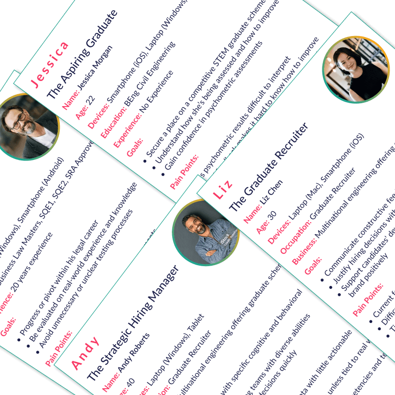
To build on my initial research, I spoke with the customer success team, interviewed customers, and reviewed feedback from candidate surveys. This helped me create and update four key personas:
Graduate candidates
Experienced candidates
Hiring teams
Business Psychologists
User maps
I converted the personas into user maps, comparing the needs of each user. What follows is a simple breakdown of the user and their need.
Graduate candidates
Early careers looking for clear, reassuring experience with low technical friction
Hiring teams
Reduce day-to-day admin, automatically provide useful feedback while avoiding additional support burden
Experienced candidates
More aware of professional world, looking to understand results and identify opportunities for development
Business Psychologists
Ensure validity and communicate results appropriately, avoid mistakes in regulated environments
Market research
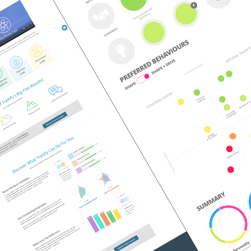
I investigated multiple similar businesses offering psychometric and trait based reviews of candidates/users.
My focus was predominantly on how data on the candidate was presented and shared.
I expanded my market research to different data-orientated assessments, such as 23andMe
Synthesis and findings
Based on personas, user journeys, competitor analysis and direct feedback the following key findings were made:
Candidate requirements
Responsive web-application
Allowing the candidate to easily open and read their report on their mobile device or desktop
Navigation
Quick and easy access to areas of the report
Trait clarity
Information on how each trait applies to their continued development
Trends
How to make improvements to their score and areas that they may wish to focus on.

The candidate wanted to gain the ability to learn from the experience – adapting and improving their behaviours.
Customer requirements
FAQs
Reduced contact with the customer from candidates on how to interpret the report
Less specificity
Reduce the number and accuracy of traits that the candidates can request feedback about
Value
Act as an additional service for candidates outside of the customers hiring process

The customer wanted to provide valuable feedback for the candidate without placing the onus on them. Reducing time and resource for hiring managers and recruiters.
Key design decisions
Move from PDF to responsive web service
The existing feedback report had grown into a complex PDF containing more than 40 data points creating several problems:
Candidates had to navigate a long, linear document
information was difficult to prioritise
the experience didn't work well on mobile
candidates had difficulty understanding some of the terminology and results
the report was heavily influenced by bespoke customer requirements
changes to the underlying assessment model would make the document increasingly difficult to maintain.
Design options
Improve the PDF
optimise typography
improve hierarchy
introduce better navigation
make it more mobile-friendly.
Create a responsive digital report
treat feedback as a digital service
allow progressive disclosure
make information responsive
support future changes to the assessment model.
Rather than optimise the existing PDF, I treated candidate feedback as a digital service in its own right. This allowed us to address the underlying usability problems while creating a scalable foundation for future changes to the assessment model.
The move to a responsive web application
How should complex scores be communicated
Competing problems and requirements
Psychometric requirement
The results need to accurately represent the assessment methodology without providing too much detail
Candidate requirement
Candidates need to understand what the results mean, how they performed and against what were they scored
UX requirement
The visualisation shouldn't introduce additional cognitive load
Customer requirement
The result needed to be understandable without a recruiter or customer explaining it
Exploration
Scoring was extremely important from a psychometric perspective so all work was completed with Psychometric SMEs inclusion.
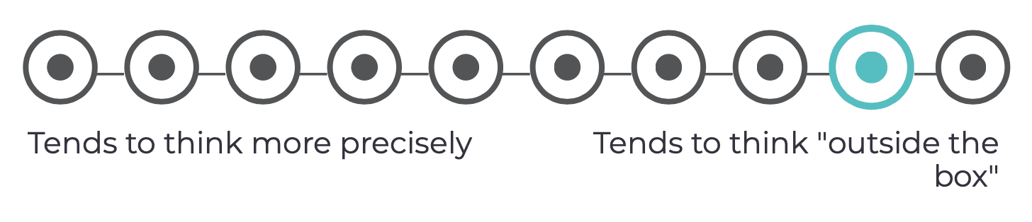
10-point polar scale
Initial designs were based on the existing 10-point polar scale in the original report, with the addition of further information provided to give customer context.

The fidelity provided by a 10-point scale made Psychometric SMEs uncomfortable due to the implied level of certainty, customers were unprepared to provide an explanation for individual scores and candidates did not find this level of fidelity useful.
The issue wasn't the visual representation of the score, but instead the interpretation.
3-point radial scale
Psychometric SMEs suggested moving away from the segmented approach and move toward a 3 point scale, showing below-average, average and above average representing trends.


Influenced by competitor patterns, I explored radial scales to show Low, Medium, and High trait scores. I tested this concept internally to validate its usability.
Testing revealed that users required additional explanation to correctly interpret the scores. This reduced visual clarity and added cognitive load. Since the product was intentionally moving away from highly precise scoring, the need for extra explanation worked against the design goals, leading me to rule out this approach.
3-point polar scale
Psychometric SMEs suggested moving away from the segmented approach and move toward a 3 point scale, showing below-average, average and above average representing trends.
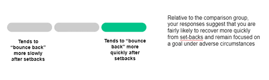
Initial design with description

Final design
Polar scales were ultimately chosen to communicate below average, average, and above average scores in a clear and approachable way. Each point on the scale was supported by concise, descriptive language that explained how the score influenced the trait, rather than focusing on numerical precision.
This approach reduced cognitive load, maintained visual simplicity, and aligned with the product direction of providing meaningful insight without over-accurate scoring. It also helped set clearer expectations for candidates, reducing the need for follow-up questions or external interpretation.
How much information is enough?
The challenge
The original candidate report suffered from providing too much information, giving candidates a detailed picture of their assessment results. The information presented didn't necessarily relate to what the candidates were actually being tested on, causing customers to receive questions from candidates for further explanation.
40+ traits
difficult to navigate
harder to prioritise
increased cognitive load
unclear relevance
Too little information
potentially generic
less useful
limited development insight
greater reliance on the customer to explain
The solution
Personality based Success Criteria
The move to a scalable SaaS platform changed the selection process, reducing the potential 40+ traits to 4 personality-based "Success Criteria" each containing 3 relevant traits. Whilst the tasks continued to measure all 40+ traits only 12 traits were exposed to the candidate, reducing the cognitive load, aligning the assessment with the role's expectations and reducing potential for customer outreach.

Wireframes
With our key design decisions completed I created medium-fidelity designs for usability testing across both mobile and desktop. These were tested internally and reviewed with engineers to ensure the solutions were technically feasible.
Working at wireframe level allowed for rapid iteration and helped keep feedback focused on navigation and usability, rather than visual styling.

Mobile wireframes

Desktop wireframes
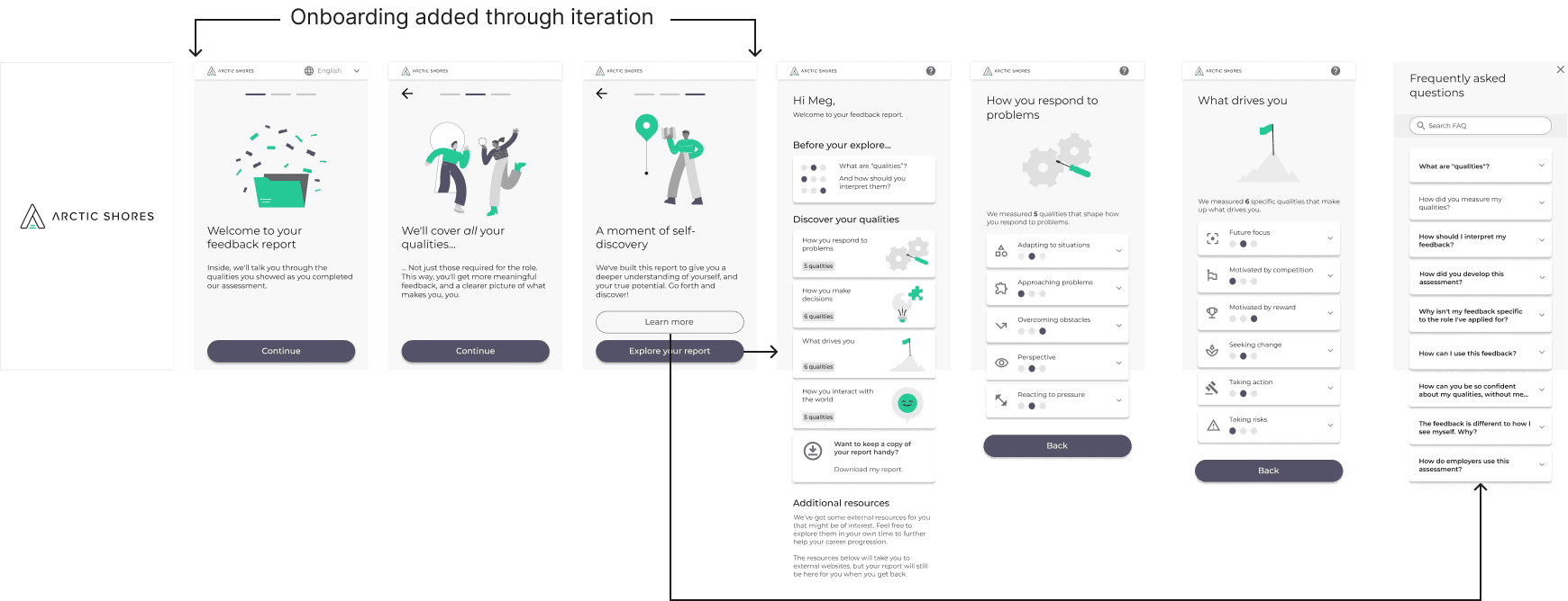
Onboarding
Feedback showed that candidates felt overwhelmed when landing on the page, leading to initial discomfort.
To address this, I introduced an onboarding journey that provided clear guidance upfront and quick access to FAQs. This reduced cognitive load and lowered the likelihood of candidates needing to contact customer support for clarification.
Release and ongoing testing
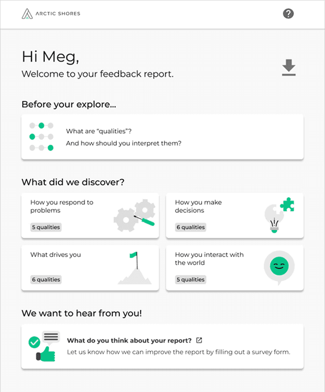
Final design
Ongoing testing

Following the release of the second version of the Candidate Feedback Report a feedback survey was introduced to get continuous feedback and look for trends. Some concerns remained with the candidate:
Not enough detail
Candidates struggled with average scores.
By presenting only below, average and above candidates found that the amount of detail was not enough.
No opportunity to improve.
The candidate received little to no information as to how to improve their score. As the the assessment was promoted as personality-based, it did not necessarily align with a job role.
Sparse design
Design
Feedback provided by candidates suggested that the design was too corporate and sparse.
Layout
Some candidates commented on how broken up the areas were and how it had become a challenge to navigate to exact traits.
Improved rating
Based on the feedback survey the candidate report showed a strong jump in approval rating:
Candidate approval rating: 4/5
Designing for change
The move to skill enablers
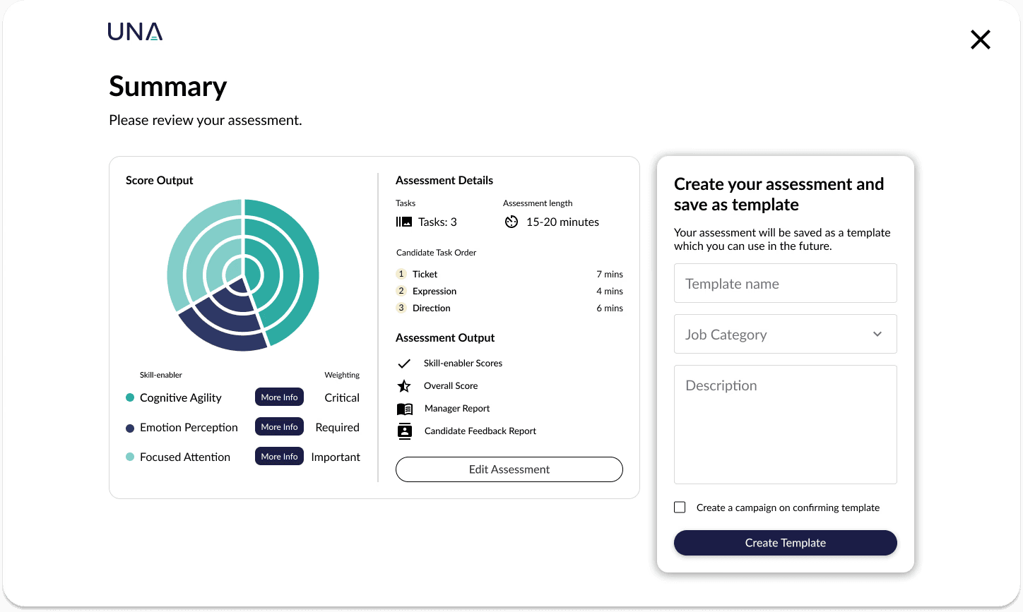
In an effort to improve test and retest, reliability and future-proof the assessment against AI, a big change occurred in the product with the introduction of skill enablers.
A significant shift from a personality-based framework to a skills-based approach, requiring a reconsideration of the information provided to candidates.
The move to Skill Enablers reduced the 15 personality-based success criteria (encompassing more than 40 individual traits) to a total of six traits risked exacerbating existing concerns that candidate feedback lacked sufficient detail and depth.
Opportunity to iteratively improve
Dealing with sparsity
I reviewed the report layout following candidate feedback showed it felt too sparse on desktop.
Existing single column
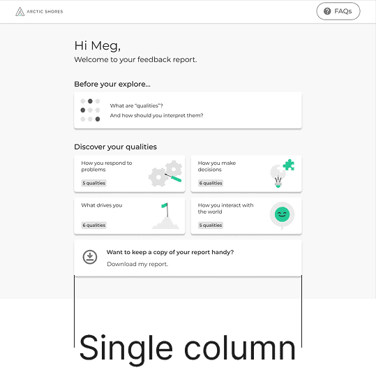
The existing single column felt bare without context or introductory information
Updated multi column

Additional information
Introduction and detail was added to the left column, this included management of the report (including, downloading a PDF version)
Layout
The layout introduced two main areas of information, the introduction/management area and the skill-enablers
Improving detail
Based on the feedback from candidates we found they struggled with the average score, with input from psychometric SMEs, I adopted a four-point scoring approach with no average score and developed clear, candidate-focused language to explain this methodology. I also expanded the information provided for each skill, reducing the total number of traits while delivering richer insight and more actionable feedback on how candidates could develop and improve in each area.
4 point scale
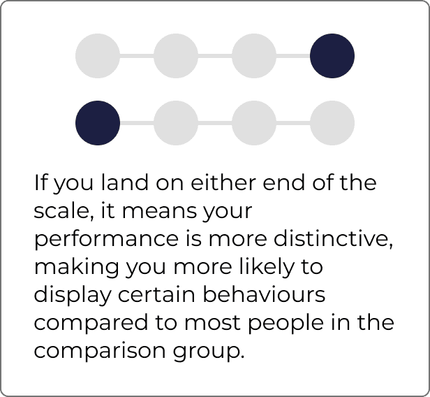
Updated scoring and design, including descriptions
Skill Enabler iteration
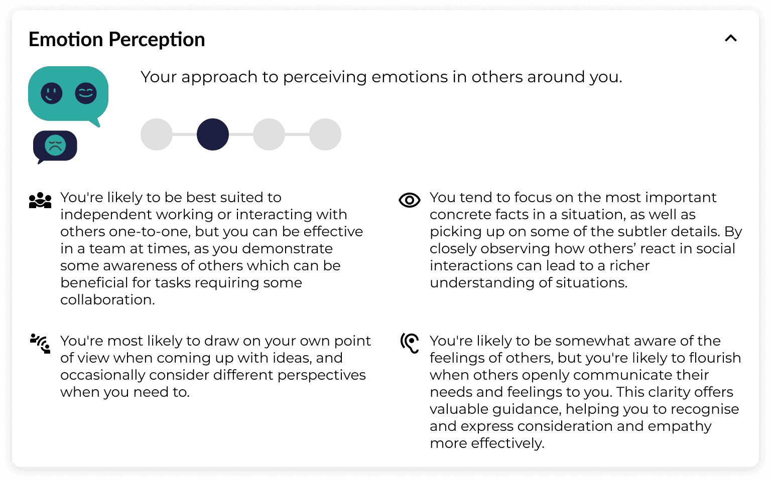
The final skill-enabler score design presented score and description of traits and ways to improve the candidates score.
Final designs
Onboarding
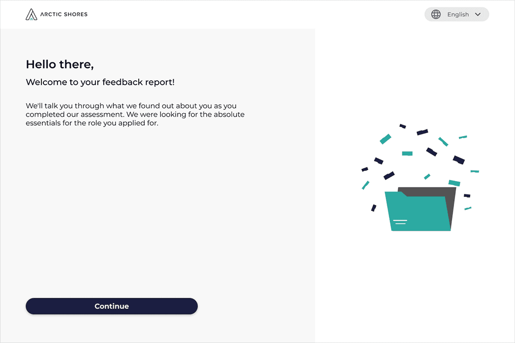
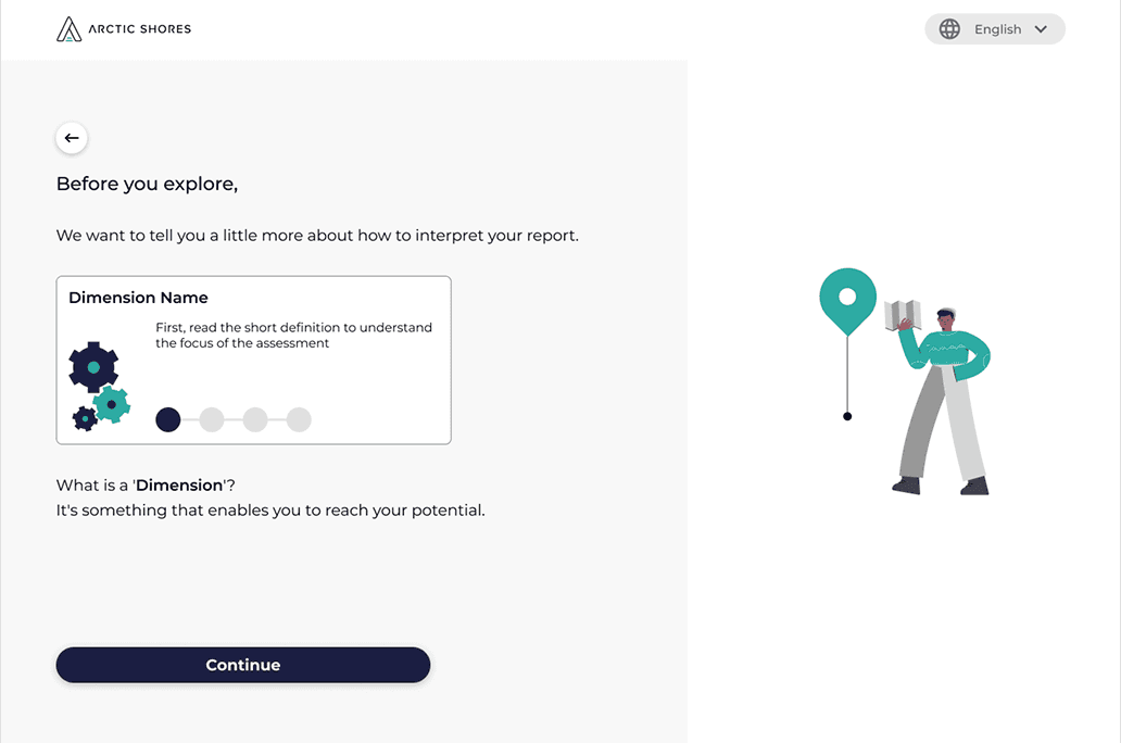
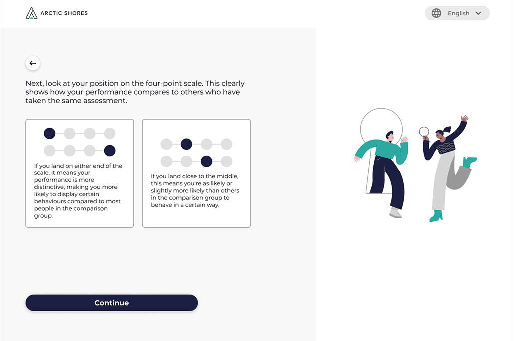
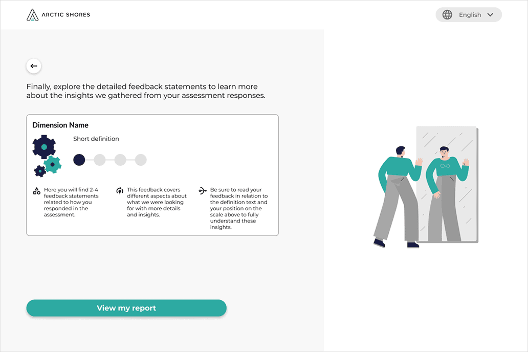
The final onboarding journey was redesigned to match the onboarding journey of the assessment
Desktop
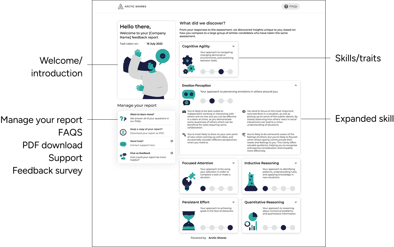
Mobile

Single column with horizontal scrolling for the traits
Outcome and impacts
In the final round, the third iteration received consistently positive feedback, with participants describing the experience as friendly, lively, and intuitive. The proposed solutions were validated through both internal and external usability testing, which confirmed their effectiveness for users.
Candidate feedback
After release testing continued to understand whether the new designs met the concerns initially introduced by the change to the web-application.
Candidates used the following words to describe their experience with the new feedback report:
Friendly
Lively
Caring
Minimal
Intuitive
Simplistic
Concise
Flowing
Insightful
Captivating
Welcoming
Clear
Informative
Helpful
Candidate approval rating: 4/5
Reflection and key learnings
Evidence beats visual preference
Testing showed that a visually attractive scoring model created more cognitive load. I learned to prioritise comprehension over visual novelty when communicating complex information.
Inclusion is contextual
Designing for different levels of technological confidence changed decisions around mobile access, onboarding, navigation and the ability to retain a PDF version.
Design for organisational change
The subsequent move to Skill Enablers demonstrated the value of designing a flexible information architecture rather than optimising solely for the initial requirements.